
The brief
One look, every Sunday.
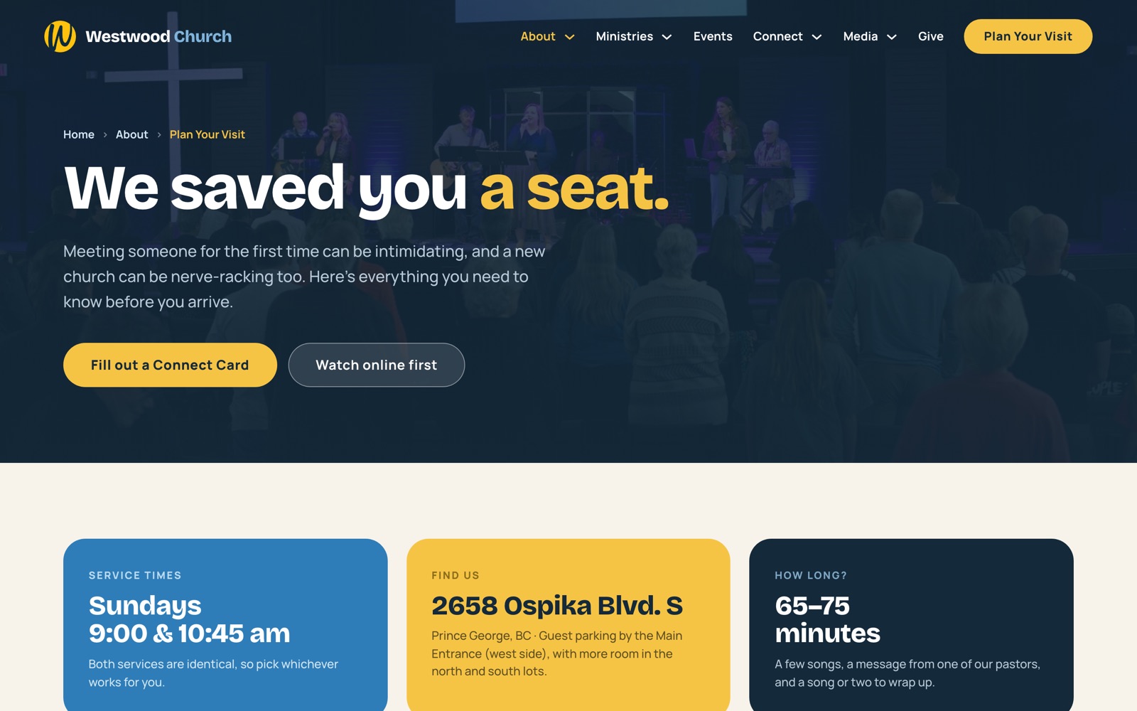
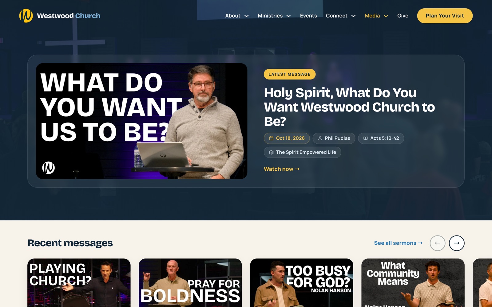
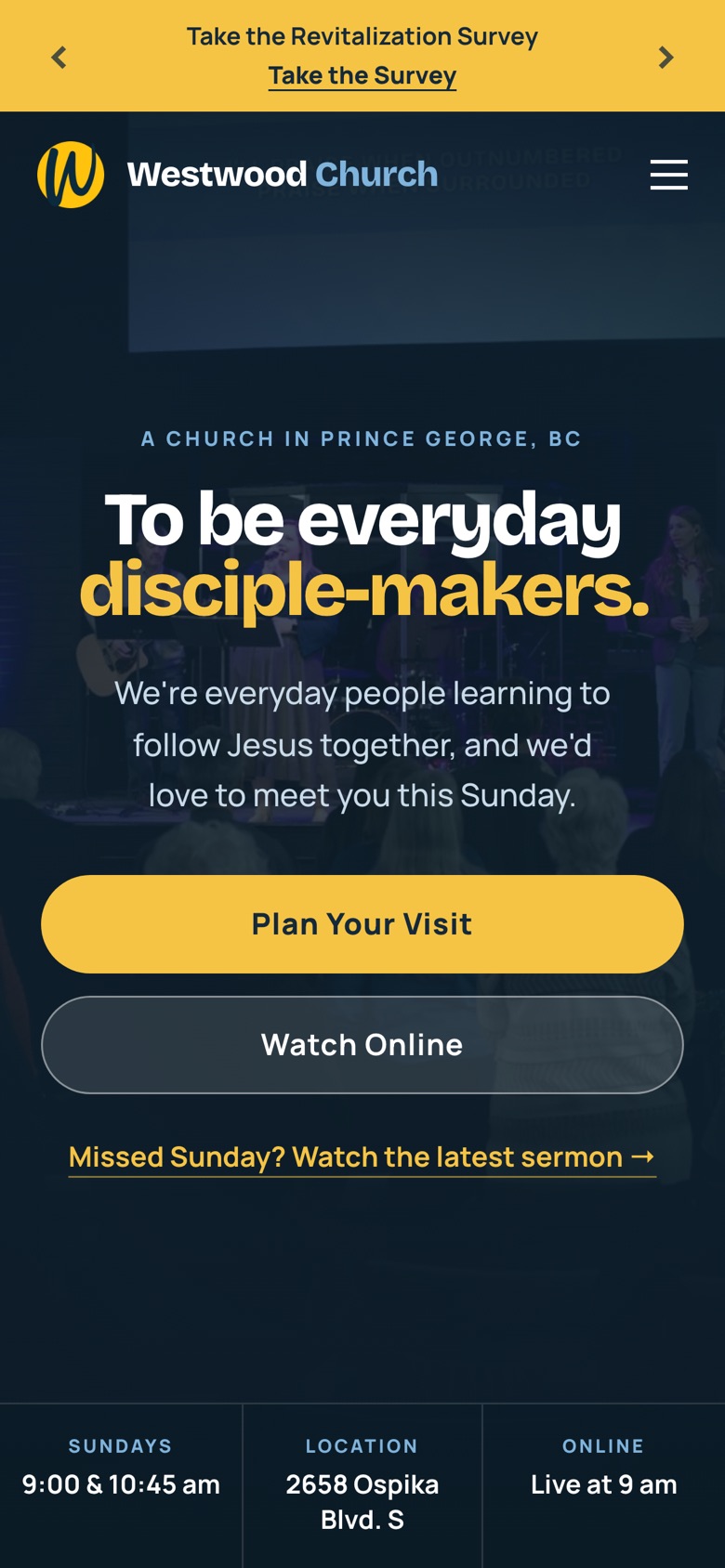
Westwood's slides, bulletins, posters, nametags and website came from many hands. The church needed one warm, plain-spoken look that volunteers could apply without a designer in the room.
What I built
A system, not a style sheet.
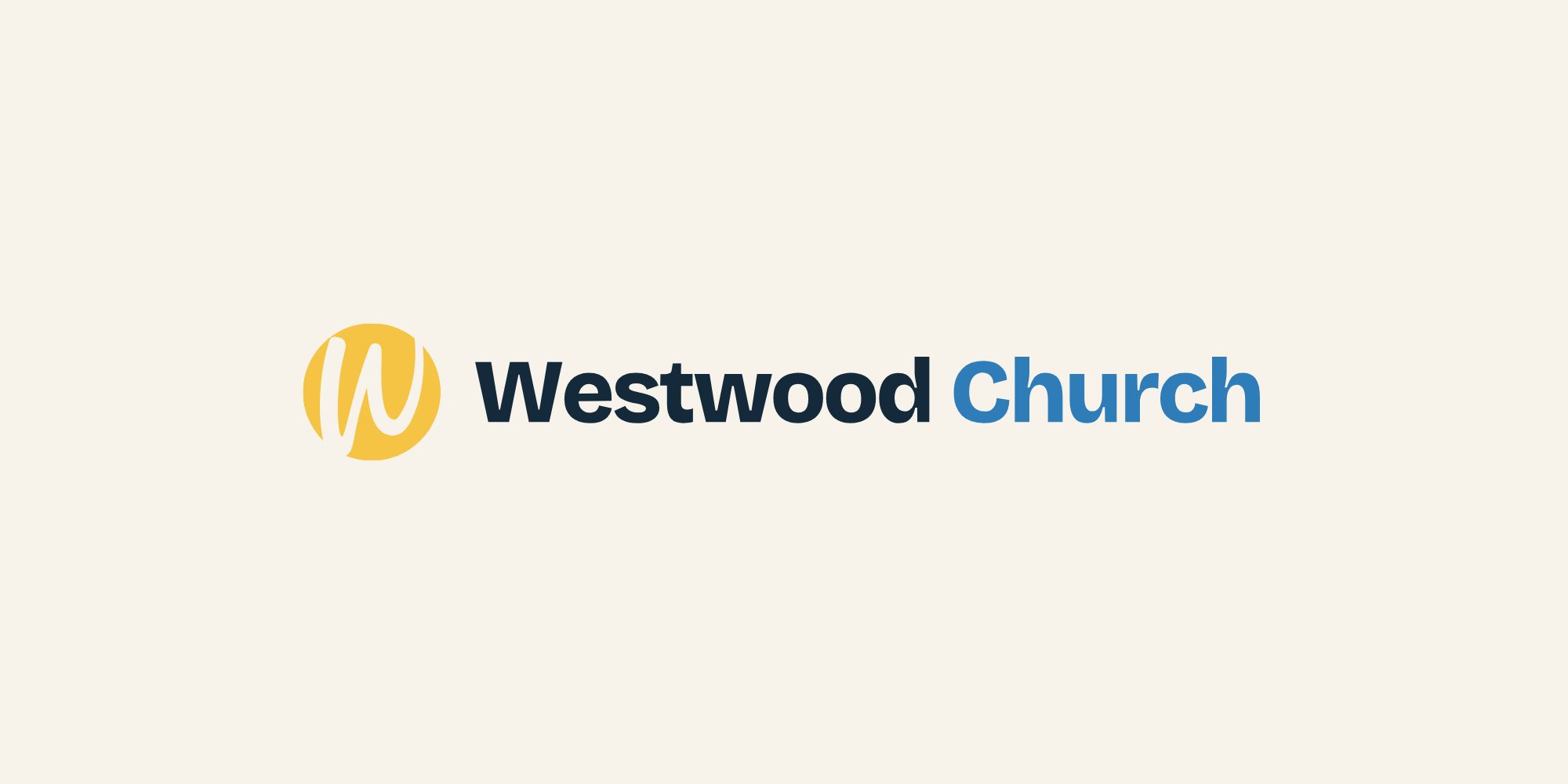
A documented brand system: the gold W mark and its lockups, Westwood Kids and Youth sub-brands, five brand colours with ministry-area palettes, Bricolage Grotesque and Manrope type, and components for announcement slides, documents, posters and nametags.
Brand guide
Logo, colour and type.
Logo


Colour
Cream#F7F3EA
Navy#14293A
Blue#2E7DB8
Light Blue#7FB4DC
Gold#F6C445
Type
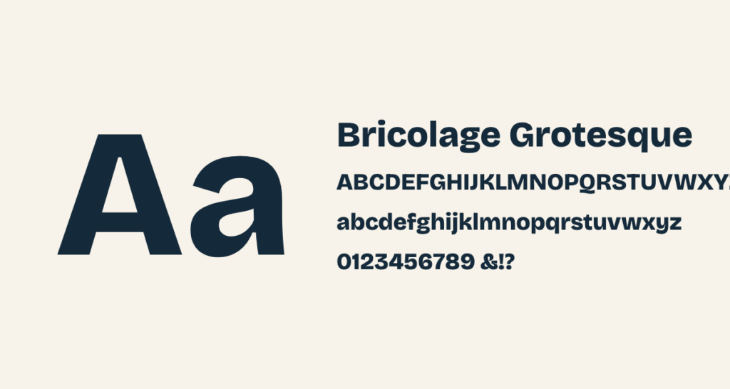
HeadlinesBricolage Grotesque
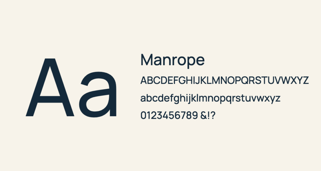
BodyManrope
01Logos + sub-brands
The gold W mark, horizontal and stacked lockups, and Kids and Youth lockups for light and dark grounds.
02Ministry palettes
Each volunteer team has its own card and strip colours, taken from its nametag.
03Ready-made pieces
Slides, letters, posters and nametags built from the same components, so everything matches.